
Brazil's most popular bank arrived in the United States, and its biggest problem was not the regulator
When Nubank began operating in the United States in September 2026 under the Nu brand, the team had already navigated months of regulatory work, negotiations with a partner bank in Kansas City, and the design of a product architecture for a market with rules completely different from those in Brazil. All of that, according to co-founder Cristina Junqueira, was the manageable part. The hardest part was the brand.
That statement is neither modest nor rhetorical: it is a signal of where the most interesting structural problem of this expansion lies. Nubank built, in just over a decade, a base of more than 140 million customers in Brazil, Mexico, and Colombia. In Brazil, that number represents more than half of all adults in the country. Its purple color became synonymous with accessible digital banking in Latin America. And that success is precisely the source of the problem the company is now trying to solve.
When your brand attributes become category attributes
Purple in fintech stopped being a signal of differentiation several years ago. Arthur Foliard, executive creative director at the agency Koto in New York, which designed Nu's new visual identity, puts it bluntly: the color is everywhere within the sector. What was a smart chromatic bet in 2013 — when no traditional bank would have dared use that shade — progressively diluted as hundreds of competitors adopted the same visual signal to project modernity and accessibility.
This is a recognizable pattern in the history of category branding. Companies that define the visual language of a sector reap first-mover advantage for a limited period. Afterward, the market absorbs and replicates those codes. By the time the twentieth imitator adopts the same color, the pioneer no longer owns anything exclusive in the mind of the new consumer — the one who never experienced the original difference.
Nubank reached that point. Its own executives acknowledge it. The decision they made in response to that diagnosis deserves close technical attention, because it was not the obvious one. Rather than abandoning purple and redefining the palette from scratch — which would have meant sacrificing decades of accumulated recognition among 140 million existing customers — they chose to refine the color treatment and compensate for the loss of chromatic exclusivity with a broader design system: a proprietary typeface, illustration with specific personality, motion, and physical packaging.
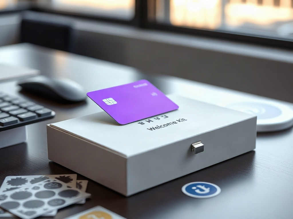
The result is Nu Sans, a proprietary typeface designed to function as an expressive headline font and as functional text within a mobile application. Added to that is a welcome kit with metal cards, a magnetic closure, and stickers — a physical object in a sector that has spent years betting on total dematerialization. The bet has its own logic: in a market where a digital bank account is a commodity, a tangible onboarding experience generates a moment of memory that purely digital onboarding rarely achieves.
What the Koto and Nubank team attempted to do — and this is where the decision becomes structurally interesting — was to recover brand exclusivity without moving the most recognizable asset. That demands a higher level of execution than simply changing colors. If the typography, motion, and illustration do not work with sufficient coherence and presence, the entire system collapses over a purple background that no one recognizes as distinctly Nu's.
The structure behind the expansion narrative
The entry into the U.S. market has a financial mechanics that deserves to be read with more detachment than the global expansion narrative typically invites.
Nu operates in the United States through Lead Bank, an FDIC-insured bank based in Kansas City. This model — known in the industry as banking-as-a-service or the partner-bank model — allows Nubank to offer regulated products without yet holding its own banking license in the country. The initial product includes deposit accounts with a daily yield of 3.50% APY, fee-free transfers, and a no-annual-fee credit card with unlimited 1.5% cashback.
CEO David Vélez has articulated the growth thesis with a phrase that has circulated across several industry analyses: a U.S. customer can generate revenue equivalent to approximately ten customers in Brazil. If that estimate is even roughly correct, it justifies significant investment in customer acquisition, even with negative margins in the short term. The company has indicated it is willing to absorb up to 100 basis points of pressure on its efficiency ratio to fund the expansion, which analysts cited by specialized media estimate could represent between 200 and 300 million dollars.
The target market the executive team has identified is between 100 and 150 million unbanked or underbanked U.S. consumers. That is a large number. What the available data does not specify precisely is what fraction of that segment can be captured by a foreign digital bank, with no physical presence, no credit history in the country, and without the web of cultural references that built the brand in Brazil.
Nubank does, however, have a point of entry that is not trivial: it is estimated that between 4 and 5 million of its Latin American customers already use the application or make purchases in the United States on a regular basis. That base does not need to discover the brand. It already has an active financial relationship with Nu outside its country of origin. Converting them into users of U.S. products — with a local account, card, and yield — is a relationship-expansion operation, not cold acquisition.
The agreement with Lead Bank is not merely a compliance solution. It is the difference between being able to operate today and waiting years. The application for its own banking license with federal regulators — the Office of the Comptroller of the Currency, the Federal Reserve, and the FDIC — remains in process. Industry sources report that Nubank received conditional approval in 2026, with expectations of operating as an autonomous bank in the first half of 2027. Until that happens, the dependence on Lead Bank introduces a layer of operational risk that direct expansion models do not carry: if the relationship with the partner bank becomes complicated — for regulatory, commercial, or capacity reasons — the U.S. business is exposed in a way that Nubank itself cannot resolve unilaterally.
The problem of proving that the brand travels well
The decision not to Americanize Nu's identity is explicit and deliberate. Foliard described it in direct terms: they wanted the result to feel global, not adapted for the local market. The illustrations are optimistic and whimsical. The animation has rhythm and personality. The secondary palette introduces variation without abandoning purple as the anchor.
This choice has strategic merit along at least two dimensions. The first is consistency: a brand that changes its face between markets creates friction for customers who operate in both contexts — exactly the segment of 4 to 5 million Latin American users who already use Nu in the United States. The second is positioning: in a market where U.S. digital banks compete against each other on the same attributes of simplicity and technology, an aesthetic with different roots can function as a signal of differentiation by origin, not by category.
The risk of that decision is equally clear. The U.S. consumer who does not know Nubank and has no connection to Latin America has no cultural reference to activate the brand's system of signals. For that user, Nu is a new digital bank with bright colors and friendly animations — exactly the description that could apply to a dozen competitors. The work of building meaning must be done from scratch, and the company has been explicit that its largest marketing investment is not naming-rights deals — the Inter Miami stadium, the association with the Mercedes Formula 1 team — but rather the product and customer support.
That is a posture consistent with the model that worked in Brazil, where growth was predominantly organic and referral-based. The problem is that the U.S. digital banking market has competitors with years of head start in customer acquisition, with consolidated user bases, and with the capital to sustain aggressive acquisition rates. Chime, with approximately 9.5 million active users, has already traveled the road that Nu is just beginning. Revolut, with more than 80 million global customers, is also in the process of obtaining its own banking license in the country.
Nu's bet is not to capture the mainstream U.S. market in the short term. It is to establish a base of operations with high-affinity customers — the Latin American diaspora with cross-border payment needs, underserved consumers who already use digital products — while the licensing process advances and the brand system accumulates recognition.
What the redesign reveals about the maturity of the model
A brand redesign at the moment of entry into a new market is, technically, an expensive bet. Design, production, and deployment resources are concentrated at a moment when the company still has no revenue in that market and when every point of attention should be on operations. That Nubank chose to do it now — and not two or three years from now when it already has critical mass in the United States — says something about how the executive team understands the sequence of growth.
The logic behind that sequence is defensive: if you enter a new market with an identity that is already diluting in your home market, the problem does not resolve itself with time. It amplifies. Every competitor that adopts a similar purple in the United States reduces the work Nu's brand needs to do to stand out. The cost of waiting grows progressively higher.
What the decision also reveals is that Nubank is aware that its competitive advantage does not lie solely in technology or price. In a market where a 3.50% APY yield can be matched or exceeded by other players, where 1.5% cashback is a standard value proposition, and where fee-free transfers are increasingly common, differentiation must come from somewhere else. Design, the onboarding experience, and brand personality are the bet for building that distance in a market where functional attributes converge rapidly.
The point of fragility this analysis identifies does not lie in the quality of the redesign itself. It lies in the assumption that a brand system — however coherent and well-executed — can carry the weight of differentiation in a market where the company has no history, no mature referral network, and operates temporarily as a brand on top of someone else's infrastructure. The refined purple and Nu Sans are necessary tools. They are not sufficient on their own.
The structural quality of the risk Nu is taking on in its U.S. expansion is asymmetric in the right direction: the partner-bank model limits initial regulatory exposure, the existing Latin American customer base reduces the acquisition cost of the first segment, and the global design bet preserves consistency without requiring an identity rebuild later on. Where the asymmetry reverses is in the dependence on Lead Bank as an operational layer that Nu does not fully control, and in the assumption — still unvalidated in the U.S. market — that brand aesthetics and personality can build financial trust with a consumer who has never had prior contact with Nubank. That assumption is what the next twelve months will need to prove or correct.